Beach fashion colour guide for 2026: what works and why
- By
- Brigantine Meridian editorial desk
- Articles
- Beach fashion
- Date
Colour in swimwear is one of those areas where trend reporting and personal advice pull in different directions. The trend story is about what is appearing in collections; the personal advice story is about what works on your skin tone and in the light conditions of your destination. Both are worth knowing.
The 2026 colour story
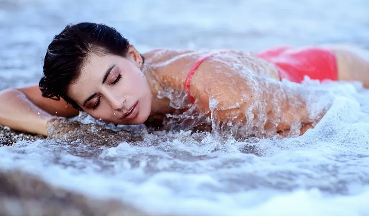
The dominant direction in the autumn 2026 collections is warm and earthy: terracotta, deep olive, warm rust, and a dusty coral that sits between the two. These colours have appeared consistently enough across independent collections to read as a genuine direction rather than a coordinated trend.
Bright white is holding as the strongest neutral. It photographs well in beach light and works as a base for accessories. The neon moment from 2024 is narrowing to accent pieces: a neon strap on an otherwise neutral set, a bright bag against a muted swimsuit.
Choosing colour for your skin tone
The standard advice on swimwear colour and skin tone is useful but often stated too simply. The more precise version: warm skin tones (yellow, olive, or golden undertones) tend to be flattered by the earthy palette that is currently strong. Terracotta and olive in particular. Cool skin tones (pink or blue undertones) are often better served by the colours that are slightly quieter this season: deep navy, forest green, a cool-toned burgundy.
Bright white works across a wider range of skin tones than most people expect, particularly in beach light. The version to avoid is a stark blue-white, which can read as harsh; an off-white or cream is more forgiving.
Colour and destination light
Beach light in Japan's southern islands is intense and warm, which means colours that look muted in a shop or on a screen can read as vivid at the beach. Terracotta and rust, in particular, become very warm in direct sunlight. Which is either an advantage or a consideration depending on your preference.
In the more diffuse light of a cloudy autumn beach day. Common in Japan from October onward. The earthy palette holds up better than bright colours, which can look flat without direct sun.
Colour is one of the easier variables to get right once you know your undertone and your destination. If you want a more specific recommendation, it comes up naturally in a styling session.
#Beach fashion #Swimwear colour #Summer fashion #Bikini styles